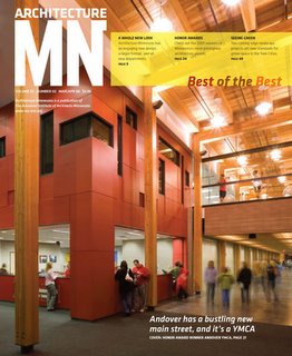
 Welcome to the new Architecture Minnesota!
From the editor, Christopher Hudson:
Hopefully you’ve already spent some time with the new March/April 2006 issue on newsstands now and in your mailbox. If so, I’d like to get some feedback from you on the following:
1. With this redesign, we are trying to attract a wider non-architect readership. What aspects of the new design and/or which new departments seem to you to be successful in this regard?
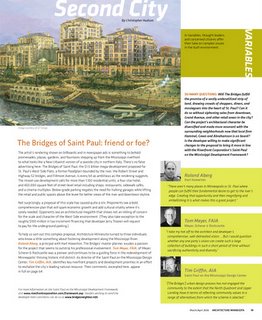
2. Which changes seem less successful? 3. See the piece on The Bridges of Saint Paul on page 19 shown at left (Variables). Should Architecture Minnesota tackle complex and sometimes controversial issues in the built environment, even when one or more of our firms is involved in the project or proposal?
Of course, you needn't restrict yourself to these questions and are invited to comment on any issue you'd like regarding this effort. You can also see the full text of the editor's comments in the online version of the latest AM issue on the AIA Minnesota website.
Bricks from the Kiln—Issue 2: Andrew Lister & Matthew Stuart in
conversation with Paul Bailey
-
BFTK #2 cover This past March, Andrew Lister and Matthew Stuart released
issue #2 of their multifarious journal, Bricks from the Kiln (BFTK). As a
journa...
8 years ago

8 comments:
I always thought I likeed the design of Architecture Minnesota, so I wasn't sure what to expect. The new design is terrific! The photos really draw you in to the story and some (not all) of the layouts are beautiful. I'll get back to you after I've had more time to look at it. So far I'd say it's two thumbs up.
This is a different "anonymous" not to be confused with the above anonymous.
To answer your third question, whether AM should tackle difficult issues involving local architects, the answer is OF COURSE, IT'S ABOUT TIME!
Now to the Bridges of St.Paul Project and its $100 tax increment financing request. Maybe the population of West Palm Beach could support this but I doubt if it will fly in our St Paul. Maybe the Donald could take a private wing and plaza and we could tape a segment of the Apprentice there? Makes me feel so New Vegas, just needs the pseudo ruins to complete the vision.
What is it with these developer "visions" anyway?
with the hope that criticism can be constructive and bring about improvement:
quite difficult to navigate, it is unclear where one article (or project) ends and another begins, and there seems to be a lack of continuity or an overarching design vision throughout the magazine. i think the large number of different fonts, font sizes, font colors, and font styles from article to article contributes to these problems.
throughout the magazine i found my eye jumping around the page without really absorbing anything. this isn't conducive to thoughtful absorbtion of or reflection on what is being presented.
many of the magazine articles have the feel of advertisements. i'm strickly talking about the look of the layout, not the text of the article.
quite a few type-os for the premiere of the new design (see the table of contents, and captioning on photos/plans for examples)
the placement of blocks of color containing text over the images is highly distracting, unnecessary, and relegates the image to the background (when it's really more about the image than the one sentence call out.)
regarding the 2005 honor awards spread: it is confusing for one project to have one page devoted to it while another project has 2, 3 or 4 pages. this seems to suggest that one award winner has precidence over another. also, it took me a long time to notice the navigation via the small yellow (or not yellow) project names in the upper corner.
overall, i prefer the old look much better.
OVERALL THE NEW DESIGN IS VERY DIFFICULT TO NAVIGATE. IT APPEARS AS IF A DIFFERENT DESIGNER PRODUCED EACH ARTICLE LEAVING ONE CONFUSED AND ANNOYED.
ARTICLES LOOK LIKE ADS. THERE IS NO SENSE OF HEIRARCHY WITHIN THE MAGAIZNE OR ARTICLES. THE ABILITY TO UNDERSTAND WHERE ONE ARTICLE BEGINS AND ANOTHER ENDS IS CONFUSING.
THIS IS NOT TO SAY THAT ARTICLE DESIGNS SHOULD NOT BE UNIQUE. BUT THERE NEEDS TO BE CLARITY WHEN ONE ARRIVES AT A NEW ARTICLE.
SOME GENERAL DESIGN RULES SHOULD ALSO BE MAINTAINED. ENDING AND BEGINNING ARTICLES ON A DOUBLE PAGE SPREAD SHOULD BE AVOIDED. THIS ADDS TO THE BURRING OF ARTICLES. ARTICLE PLACEMENT IS ALSO CRUCIAL. WITHIN THE AWARDS SECTION, EACH PROJECT SHOULD HAVE EQUAL WEIGHT, WEATHER IT HAS BEEN PUBLISHED IN THE PAST OR NOT. IT MAKES SOME PROJECTS APPEAR AS THOUGH THEY ARE MORE IMPORTANT THEN OTHERS. THIS IS ODD.
PLACING COLOR BLOCKS AND TEXT OVER IMAGES IS FINE, BUT IT IS IMPORTANT WHERE IT IS PLACED.
OVER ALL I APPRECIATE THE MOVE TO UPDATE THE MAGAZINE AND FEEL THE COVER IS THE BEST STEP IN THAT DIRECTION. THE REST OF THE MAGAZINE NEEDS A LOT OF WORK.
Content is critical.....
Highlighting architectural projects is important part of this magazines mission, but in order to grow a broader readership. It also needs to be more critical of the work that is being produced in this region. While the Bridges of St. Paul article begins to take on a more controversial project, it needs more depth and breadth to the articles. I felt that the bridges article barely scratched the surface of this large urban development project that is sparking controversy wherever it goes.
I also think that the magazine should focus on more urban issues, design issues, cultural issues and the arts. The AIA needs to reach out to the broader design community for articles, ideas and collaboration. If it choices to continue to only highlight architects and their work, it will remain an architects magazine. We should embrace the design community that makes this place so important. Other national magazines are covering the Minneapolis design scene, why hasn’t our own magazine done so? Push the envelope, take some changes, engage the design community that surrounds us and this magazine could grow into an important part of the design dialog that shapes our community.
I love the new design. I read it cover to cover, was up way past my bed time devouring it. I like the lighter feel some of the articles have. As a vehicle to attract the public beyond insider professionals, I think it will be very appealing.
Oddly, I liked finding out about James Dayton's favorite fishing flies. I wasn't expecting to enjoy that. It added a layer of humanity to architecture, that speaks to the work/life balance we struggle with at times.
The more aggessive design of articles, compared in one comment to ads, actually attracted me to the content. We're assailed by advertising 24/7, and bully for desiging content to be as (or more) attractive than the paid bits.
As architects, we can't help but live aesthetic lives. The restraunts we visit, the magazines we read, the company we keep all speak to our training as designers. The new design speaks to more than just the making of buildings, but to the lives of the people who make, use, and enjoy the built environment.
Great job!
I like the energy and range of emotions communicated by the new design for Architecture Minnesota. It conveys that architecture is a process and, to me, invites the reader to participate.
It looks great. I was at the book store week and the new cover just popped off the shelves.
Post a Comment